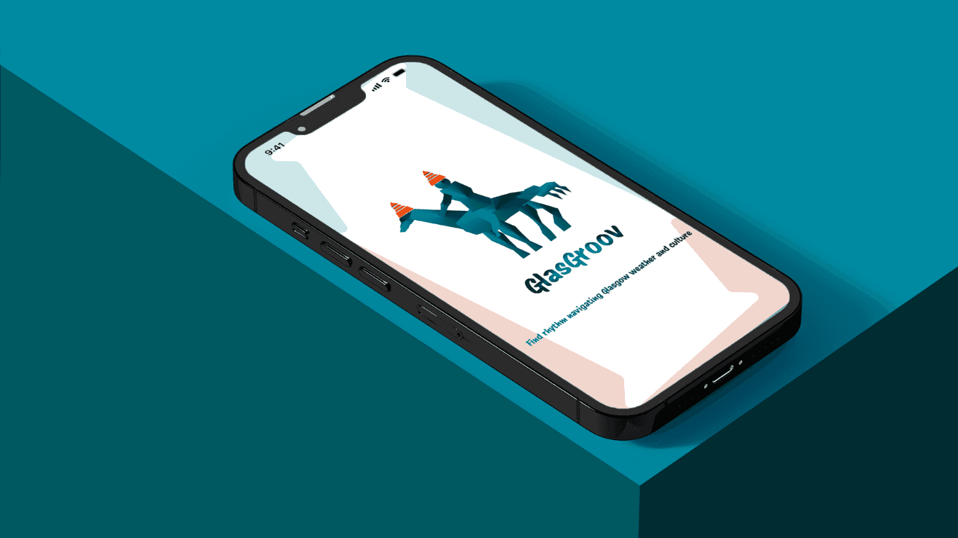
The Problem
International students aged 18–24 arriving in Glasgow face fragmented digital experiences. They use separate platforms for accommodation, events, transport, discounts, and job searches — increasing stress and reducing their ability to feel socially connected.
Many report:
Difficulty discovering affordable activities
Financial anxiety
Social isolation
Information overload
The Goal
Design a centralized, personalized mobile experience that helps students:
Discover events and deals
Explore Glasgow
Connect with peers
Reduce decision fatigue

Research & Insights
Through competitor analysis, empathy mapping, and interviews:
Key Insights
Students rely heavily on smartphones (10–13 hours/day average use).
Financial constraints influence most decisions.
Navigation & transport confusion reduces exploration.
Social belonging is a major emotional driver.

Opportunity
MVP Strategy
To avoid feature overload, I focused on 4 core features:
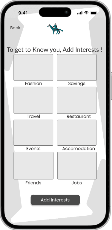
Personalized onboarding
Explore (Map + Attractions + Events)
Student Deals & Discounts
Friend Finder
Jobs and accommodation were identified as future expansion features
Key Design Decisions
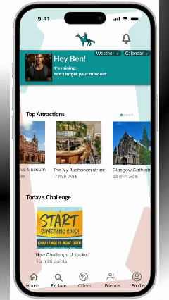
Personalized Home
Daily challenge to increase retention
Weather integrated in hero section
Top attractions based on reviews
Quick-access categories.
Explore with Interactive Map
Filter by category
Price visible on map markers
Walking distance displayed
Friend Finder
Group chat integration
Match by interests
Encourages inclusion
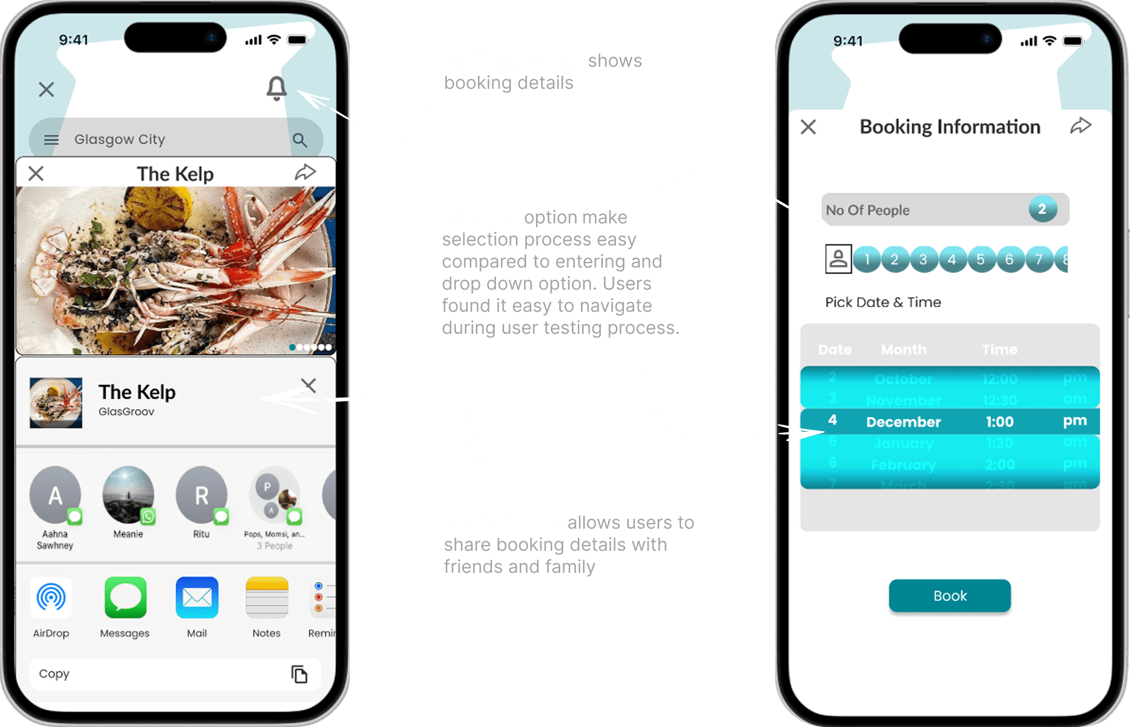
Offers Section
Copy code feature
Clear discount cards
Redemption clarity

Accessibility
Zoom slider
Contrast mode
Clear typography hierarchy
Consistent icon system

LO- FI WIREFRAMES
To quickly validate ideas, I created low-fidelity wireframes that mapped out the core flows — event booking, restaurant booking, friend search, and gamification features. Keeping the designs simple allowed me to test navigation and information hierarchy early without being distracted by visuals. Feedback from students at this stage helped me spot pain points, refine the bottom navigation, and prioritize the features that mattered most before moving into detailed design.


HI- FI PROTOTYPE


To address feelings of isolation, I added a friend search and connection feature. Students can look up peers with shared interests, view mutual events, and connect before or after attending activities. This bridges the gap between event discovery and meaningful social connection.
UX Strategy:
Social Integration: Encourages real-world friendships.
Belongingness: Directly addresses student isolation uncovered in research.
Findings:
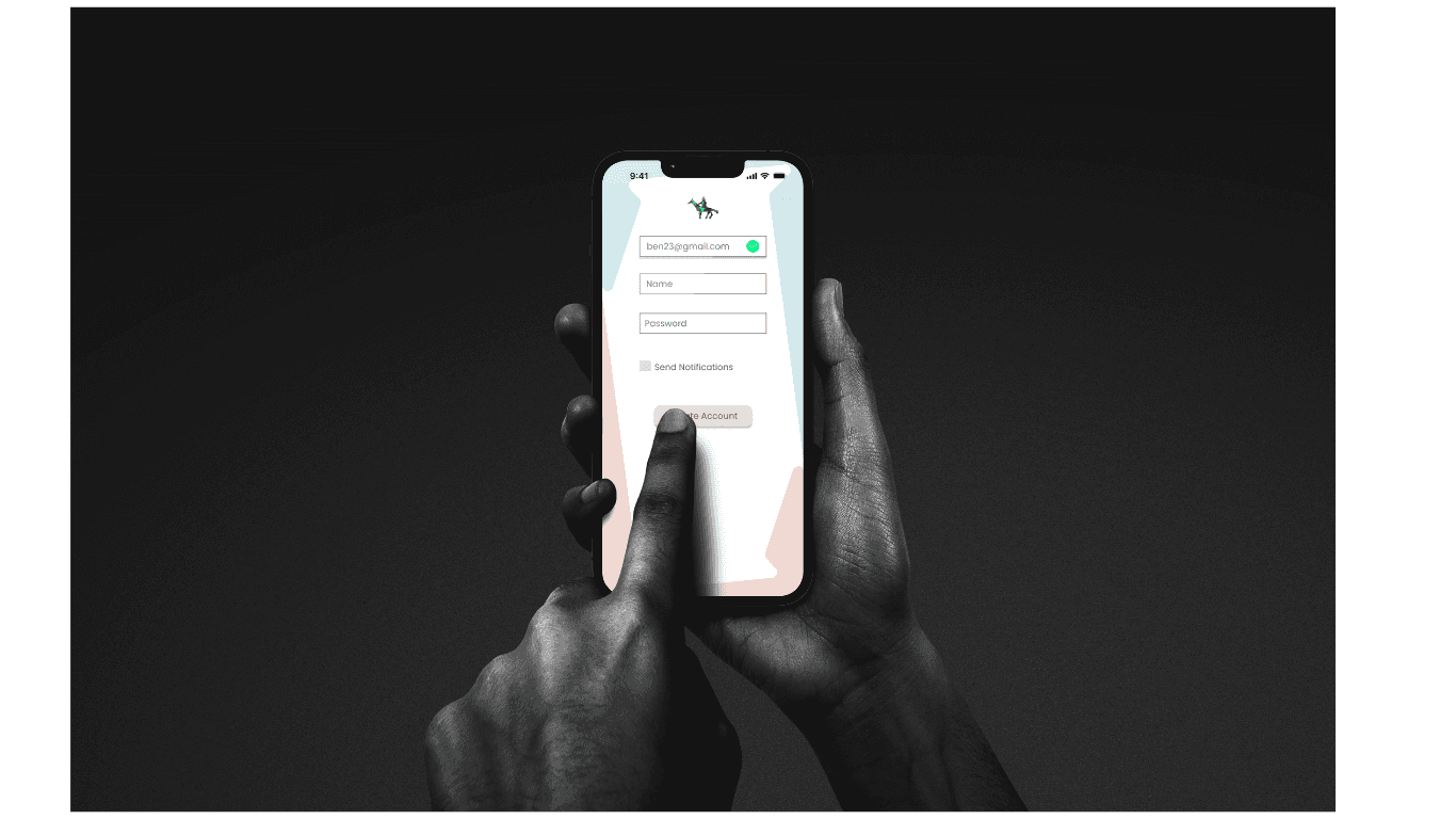
Login options were confusing → simplified.
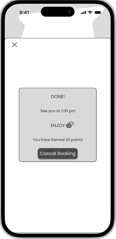
Gradient booking page reduced readability → adjusted.
Mixed icon styles → standardized.
Navigation repositioned for better thumb reach.
After iteration:
Login options were confusing → simplified.
Gradient booking page reduced readability → adjusted.
Mixed icon styles → standardized.
Navigation repositioned for better thumb reach.
Increased clarity in booking flow
Reduced navigation confusion
Improved accessibility compliance
Positive qualitative feedback from testers
Conduct larger usability testing sample
Track retention impact of daily challenges
Explore sustainable monetization model