


OVERVIEW
This case study explores how I designed GlasGroov, a mobile app that addresses the challenges faced by international students in Glasgow. By consolidating events, student discounts, and community connections into a single platform, I aimed to reduce the frustration of fragmented discovery and foster a stronger sense of belonging. From research to testing, I led the end-to-end design process to craft an experience that balances usability, engagement, and social impact.
WHAT IS GLASGROOV?
GlasGroov is a student-focused initiative designed to make life easier for international students in Glasgow. With the city welcoming thousands of learners from around the world every year, the project set out to bridge gaps in event discovery, social connection, and affordable living.
Inspired by the challenges students face when navigating a new city, GlasGroov aimed to provide a smarter alternative to scattered event listings, costly outings, and the social isolation that many newcomers experience.
Designed for international students, local businesses, and civic stakeholders, GlasGroov sought to simplify student life, encourage cultural exchange, and strengthen Glasgow’s reputation as a welcoming, inclusive city.

DESIGN PROCESS
I applied the Double Diamond framework to keep my process structured and human centered. In the Discover phase, I explored the lived experiences of international students through surveys and interviews, identifying pain points around event discovery, affordability, and isolation. During Define, I synthesized insights into personas and journey maps to clarify the real challenge: students needed a single, reliable way to find and join activities. In Develop, I experimented with wireframes and navigation patterns, iterating based on usability feedback to simplify the experience around three core features — Events, Discounts, and Chat. Finally, in Deliver, I crafted high-fidelity prototypes with a clean, student-friendly interface and validated them through usability testing. This structured approach helped me move from broad exploration to a focused, validated solution that balanced usability with community impact.

ABOUT CLIENT
Glasgow City Council is the local authority governing Scotland’s largest city. With a focus on community wellbeing and inclusivity, the Council plays a key role in supporting residents, businesses, and the city’s large international student population. Its initiatives aim to improve access to services, encourage cultural exchange, and strengthen Glasgow’s reputation as a welcoming global hub. By partnering with local institutions and businesses, the Council works to boost economic growth while fostering stronger community integration.

PROBLEM STATEMENT
Each year, thousands of students arrive in Glasgow, eager to explore their new city. However, they often face challenges in finding reliable, student-focused information about local events, amenities, and services. Existing resources are scattered, outdated, or not tailored to student needs, leading to missed opportunities and a sense of disconnection.
The Challenge
Students in Glasgow told me the same story again and again: “I hear about events too late” or “I waste hours checking multiple apps and still miss out.” Beyond FOMO, many felt isolated and struggled to connect with peers.
My Approach
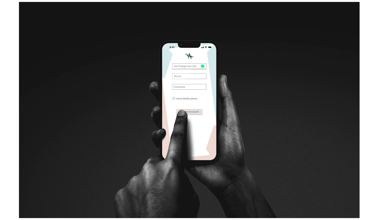
I designed GlasGroov from scratch. Over 8 weeks, I led the entire process — research, personas, user journeys, design iterations, and testing. My goal: reduce friction, save money, and strengthen community by gamification feature.
DISCOVER PHASE
The target audience of this brief is 18-24 years old, known as Gen-Z or ZOMMERS born from 1997 to 2012. They are digital generation for whom social media like Instagram, TikTok, YouTube and many more plays a significant role.
TARGET DEMOGRAPHICS RESERACH


TARGET
DEMOGRAPHICS
COMPETITOR ANALYSIS
What's On Glasgow Website

USER TESTING


COMPETITOR ANALYSIS
Citymapper App


A competitive review of What’s On Glasgow and Citymapper revealed clear opportunities. While both offer valuable functions, neither fully addresses the needs of international students looking for an integrated social, cultural, and lifestyle experience. By bridging these gaps, GlasGroov positions itself as a centralised, student-first platform combining event discovery, social connection, and local discounts in one app.
Initial Hypotheses
What we believed
Based on research insights, I formulated key hypotheses to guide GlasGroov’s design:
Students need centralization
Scattered tools create friction; one hub would simplify planning.
Personalisation drives engagement
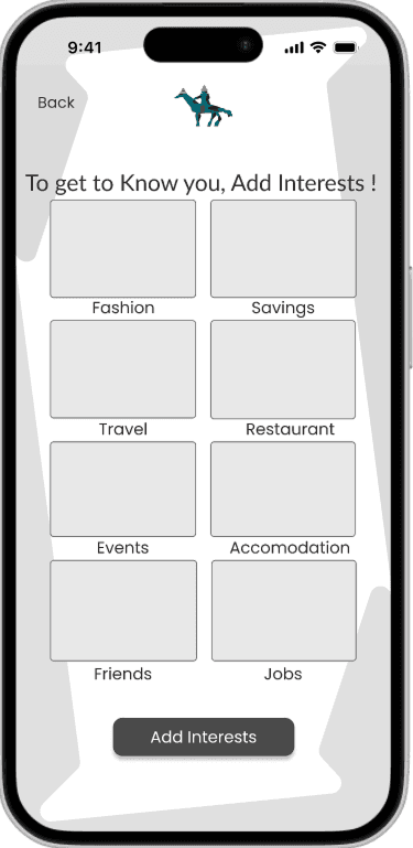
Tailored recommendations for events and discounts help students feel the app is relevant to their unique interests.
Navigation with context matters
Maps should not only show directions but also venues, pricing, and nearby offers to make decision-making easier.
Social connection combats isolation
Features like friend search and chat enable international students to form bonds and feel integrated into the community.
Gamification builds habits
Points, rewards, and challenges transform participation into a fun routine, encouraging sustained usage.
EMPATHY MAP
As per empathy map, international students (18-24 years old) will find difficult to navigate to places in Glasgow. They want to know about famous places, navigation route, transportation facilities, restaurant, events, accommodation To ease their life, we have to provide all the information in single app so instead of using multiple apps, they can find all the necessary information in our app.

PERSONAS

DEFINE PHASE
With a clear understanding of student challenges and motivations, I translated insights into focused opportunity statements. By framing problems through Point of view (POV) and How Might We questions, I bridged the gap between research and ideation—keeping my thinking grounded, purposeful, and user-centred.
Point of View (POV)


How Might We (HMW)


Kano & MosCow Model
To shape a focused MVP for GlasGroov, I combined the Kano model with the MoSCoW framework. This allowed me to balance what users truly value with what could be realistically delivered.
Kano Analysis highlighted which features were must-be basics (e.g., event discovery), which could be performance enhancers (discounts, chat), and which were potential delighters (personalized recommendations, cultural event highlights).
MoSCoW Prioritization then translated those insights into delivery focus:
Must-Haves: Core navigation, event listings, RSVP, discounts.
Should-Haves: Lightweight personalization and reminders, built with minimal dev effort.
Could-Haves: Features like multi-language support or advanced filtering.
Won’t-Haves (for now): Large integrations like university-wide calendars.
By using Kano to understand user perception and MoSCoW to guide implementation, I ensured the MVP balanced user delight with delivery efficiency—validating the concept without overcommitting resources.

DEVELOP PHASE
With a clear understanding of student challenges and motivations, I translated insights into focused opportunity statements. By framing problems through Point of view (POV) and How Might We questions, I bridged the gap between research and ideation—keeping my thinking grounded, purposeful, and user-centred.
Style Guideline


LO- FI WIREFRAMES
To quickly validate ideas, I created low-fidelity wireframes that mapped out the core flows — event booking, restaurant booking, friend search, and gamification features. Keeping the designs simple allowed me to test navigation and information hierarchy early without being distracted by visuals. Feedback from students at this stage helped me spot pain points, refine the bottom navigation, and prioritize the features that mattered most before moving into detailed design.


USER TESTING
I have Conducted User Testing on 5 users (2 flatmates, 1 UX designer and 3 classmates). I have provided them brief about the app and observe their work flow. Noted the observations and asked them open ended questions to get more ideas about their experience.


HI- FI PROTOTYPE
Exploring and Refining Solutions
Centralizing Student Life
A single hub for events, food, and friends
Through iteration, I expanded GlasGroov from a simple event discovery tool into a broader lifestyle companion. The prototype integrates restaurant booking, event RSVPs, social discovery, and gamification — turning everyday tasks into engaging experiences while keeping the interface simple and student-friendly.
UX Strategy:
All-in-One Value: Combining multiple needs into one app reduces fragmentation.
Habit Formation: Layering social + fun elements encourages consistent use.


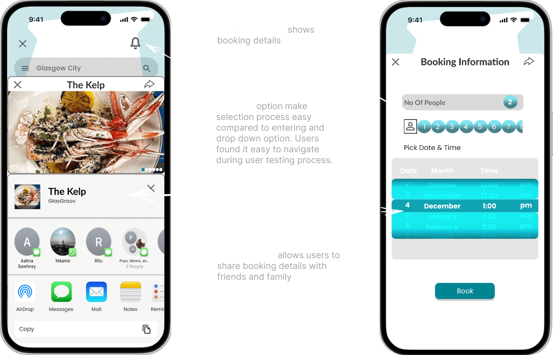
Restaurant Booking
Seamless dining made simple
I designed a booking flow where students can explore nearby restaurants directly on an integrated map. This transparency helps them make faster, more confident decisions while staying within budget. Reservations can be completed in just a few taps, reducing friction and encouraging students to dine out more often.
UX Strategy:
Transparency First: Map-based listings with prices simplify choice.
Consistency in Interaction: Familiar flows from other apps reduce the learning curve.
Community Value: Supporting local restaurants by driving more student traffic.


Event Booking
Discover and join cultural life effortlessly
Friends Search & Connection
Turning strangers into a community
To address feelings of isolation, I added a friend search and connection feature. Students can look up peers with shared interests, view mutual events, and connect before or after attending activities. This bridges the gap between event discovery and meaningful social connection.
UX Strategy:
Social Integration: Encourages real-world friendships.
Belongingness: Directly addresses student isolation uncovered in research.
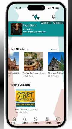

Gamification for Engagement
Making participation rewarding
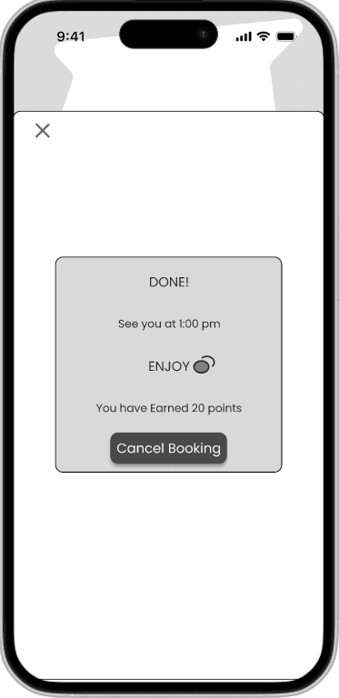
Beyond points, badges, and discounts, I introduced an interactive challenge system that encourages students to explore Glasgow. Students can complete tasks such as visiting landmarks, attending events, or dining at partner restaurants, then upload a photo as proof of participation. Successful completion unlocks rewards and points, turning everyday activities into a fun, social game. These mechanics not only motivate students to engage more actively but also foster a deeper connection with the city and community.
UX Strategy:
Motivation through Rewards: Points, discounts, and badges make exploration exciting and rewarding.
Commitment & Consistency: Ongoing challenges keep students coming back and building habits.
Cultural Integration: City-wide challenges encourage students to discover Glasgow while strengthening community bonds.

Accessibility
Designing for inclusivity
To ensure GlasGroov could be used by every student, I implemented features that support diverse accessibility needs. A Zoom option allows users to enlarge text and interface elements for better readability, while a Contrast Mode provides both light and dark themes with optimized color contrast. These adjustments make the app more usable for students with low vision, varying lighting conditions, or personal preferences.
UX Strategy:
Scalable Text & Layouts: Zoom ensures core flows remain clear and usable at any size.
High-Contrast Themes: Light and dark modes with improved contrast enhance legibility.
Inclusive Design Principle: Accessibility was integrated from the start, not added as an afterthought.

Accessibility & Inclusion
Designing for Everyone
Features like Zoom options and high-contrast themes made the prototype more inclusive during testing. Students noted that these adjustments would improve usability in varied conditions, from low lighting to individual accessibility needs
Community & Business Value
Supporting Local Ecosystems
If implemented at scale, the app could help local restaurants secure predictable student bookings and enable event organisers to reach a wider audience. While not yet validated in the real world, these outcomes align with patterns seen in similar student engagement platforms
Usability Insights
Smooth and Intuitive
In small-scale usability testing with fellow students, participants were able to complete booking and RSVP tasks with minimal guidance. They highlighted the integrated map and simple flows as features that reduced effort compared to switching between multiple apps.
Learning & Reflection
Prioritization and feedback turned ambition into clarity
Working on GlasGroov taught me how to narrow ambitious ideas into a focused MVP using frameworks like MoSCoW and Kano. I realised that contextual research with international students was essential for uncovering cultural and social barriers to participation. Running early usability tests, even with a small group, revealed navigation issues I wouldn’t have spotted alone. These lessons reinforced that designing is not just about features, but about creating solutions rooted in real needs.
Future Opportunities
From prototype to platform — scaling student belonging
Although GlasGroov began as an academic prototype, it has the potential to grow into a city-wide student engagement platform. Opportunities include richer social discovery (interest-based groups and communities), AI-driven recommendations for events and restaurants, and partnerships with universities, local councils, and businesses. Expanding accessibility with multi-language support and voice assistance would further ensure inclusivity. With these iterations, GlasGroov could scale beyond a project into a sustainable ecosystem for student life.